Trending Assets
Top investors this month
Trending Assets
Top investors this month
This chart is one of my all-time favourite charts of the stock market for 1950 to end of 2022:
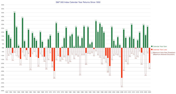
It shows the S&P 500 annual gains (green), losses (red), and the maximum drawdown investors had to endure for each year. Traders call this the maximum adverse excursion (MAE). Every year the stock market records a healthy gain, they're always be a market decline within the year.
Calendar year 2020 was extraordinary: it closed with a 16% annual gain, but we had to endure a 34% decline between 19 Feb 2020 - 23 Mar 2020. This was the market reaction to the CoronaVirus pandemic. Any long-term investor would've experienced a significant drawdown in portfolio value, yet still end up with an excellent calendar year return if they held their nerve. This is a chart I get new investors to stare at for a long time. because I need them to take it all in. When someone is just starting their stock market journey, it's hard to describe the range of emotions you go through when you put your hard-earned savings at risk. Most beginner investors tend to focus on the upside, it's exciting to think about the fortune you're going to make. But I like to concentrate their attention on the downside because that's where the real risk lies (behavioural risk). I need them to understand the "noisiness" of the market.
Of course another favourite chart is the classic chart of the jagged uptrend and the cyclical range of emotions we go through. Investors have to accept that paper drawdowns are a feature of a long-term strategy, not a bug. You simply can not avoid it.
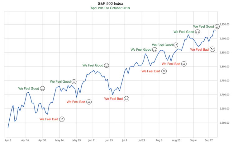
I always mention that "volatility composure" is something a long-term investor develops with experience and tenure in the market. It's difficult to imagine how you'll feel when you start enduring portfolio losses, especially when it extends over a long period of time (death by a thousand cuts). We're not emotionless automatons, even the most experienced investor is going to be annoyed watching your portfolio drop in value. We just don't allow our annoyance/pain/fear dictate our investor actions. We don't deny our emotions, we accept them for what they are, we just develop better agency over our actions. Mastery means no knee-jerk reactions.
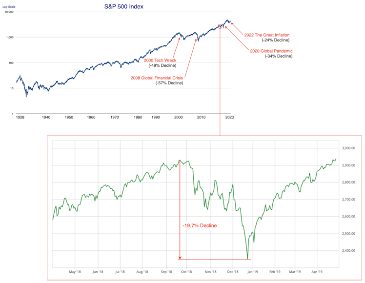
This is another chart I like to show. We always remember the 2000 Tech Wreck, 2008 Global Financial Crisis and 2020 Global Pandemic. But there are plenty of other significant corrections that affect our portfolios that forgotten over time because they're more "run of the mill". They're not notable in history and only look like a tiny squiggle in the long-term chart. This sort of correction can happen at any time and it can still be painful.
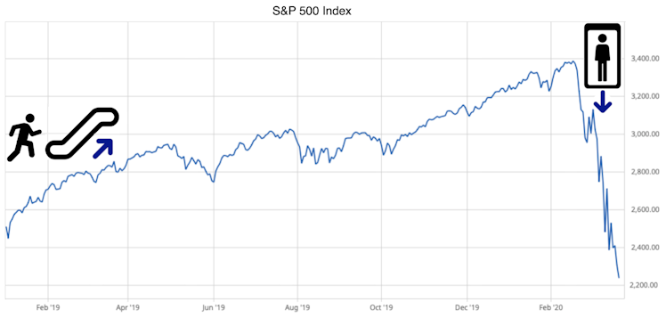
The "up the stairs, down the elevator" chart is a favourite metaphor. Growing your wealth requires a great deal of patience. Holding your nerve during a stock market calamity requires steely determination.
This chart is a little boring, but really important. Knowing your long-term base rates keeps your return expectations reasonable. It's also useful because If you find yourself lagging market returns by too much over the period of several years, you'll need to take remedial action. You first need to diagnose the problem. Maybe stock picking isn't your cup of tea. Maybe timing the market wasn't such a good idea.
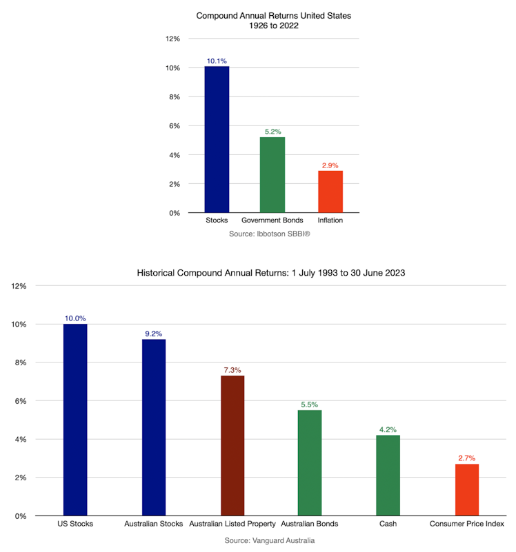
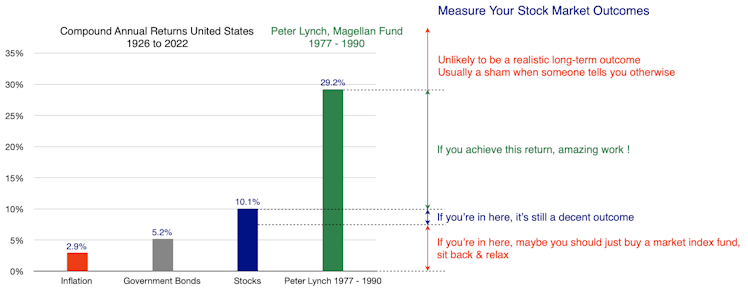
If you know your base rates and the returns of the best investors to do it in history, you have a good envelope/guardrail of returns to work with. This can keep you safe from falling victim to the numerous scams and shams out there. One of the greatest investors to ever do it was Peter Lynch who racked up a 29.2% average annual return over 13 years. If someone is selling you a higher return, it's either very high risk, not sustainable long-term and/or very likely a sham. If you can beat Peter Lunch's record sustainably over time, you're a legend. But when you first start out, set your expectations realistically. Over the long term (or even medium term), the relationship between risk and return can't be beat. Higher returns always come with higher risk. It's a law and it's immutable.
Already have an account?