Trending Assets
Top investors this month
Trending Assets
Top investors this month
Growth of TAMs over time
One of the things I have been researching lately is the growth of TAMs. My interest here is part of a long standing effort trying to understand why market cap weighted indexes work so well.
One of the criticisms of market cap weighted indexes is something I'm sure most of you have heard before: "But it just hit a Trillion dollar market cap - how much bigger can it get?"
"Aren't the top 10 companies in the $QQQ just too big to keep growing fast?"
These articles were everywhere when Apple first hit $1T 5 years ago, and now it's up another 180% since.
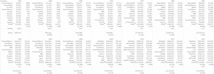
I'm still working on the takeaways, but here are some of the interesting highlights of what I've been looking at- which is going back to 1955 and looking at the collective revenue and profits of the top 10 US based companies by revenue.
Here's the raw data, lots of charts below:
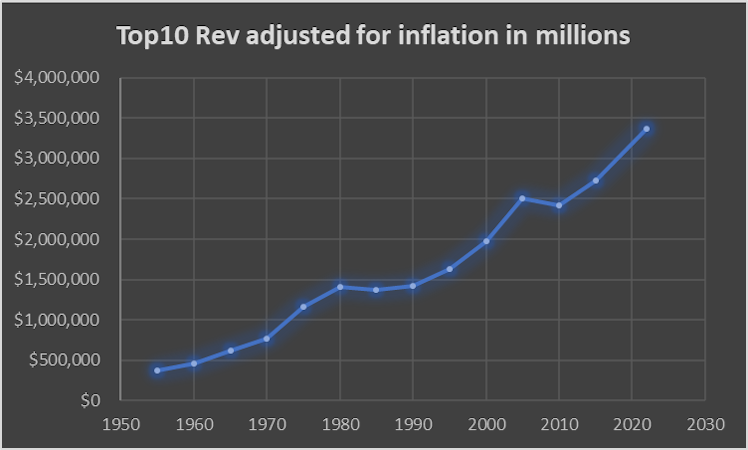
This chart is of the collective revenue of the top 10 companies by revenue adjusted for inflation going back to 1955.
This chart shows how the profit margins of the top 10 companies by revenue (collectively) have changed over time:
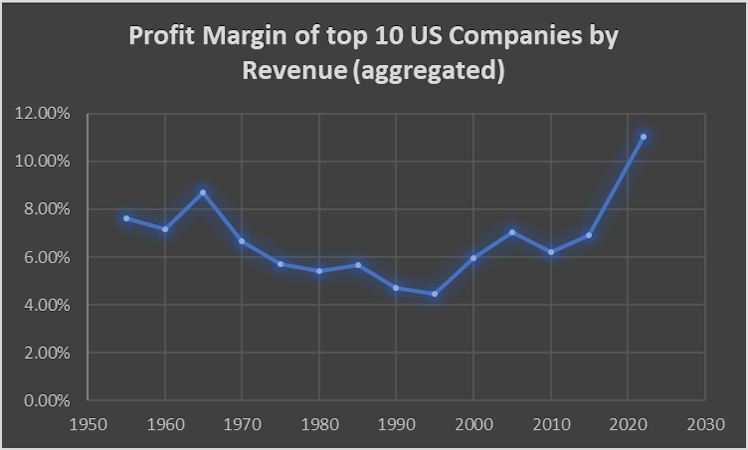
It's actually more consistent than I had expected.
As recently as 2015 only Apple of the big tech companies made it into the top 10. By 2022 there was Amazon, Apple, Google and Microsoft. The profit margins for 2022 are also skewed downwards by Amazon, they would be closer to 12.6% as a group instead of the 11.04% if it had margins more in line with what I expect beginning around 2025.
It seems starkly obvious that this profit margin figure is going to increase in the future as technology businesses replace the big insurers, Walmart and Exxon.
The TAM growth statistics are:
3.4% Annualized REAL (inflation adjusted) TAM growth per year.
Here is the TAM growth broken into 5 year increments going back to 1955. Note the outlier in the 1970-1975 period - this was due to the revenues of oil companies going up 2-3X.
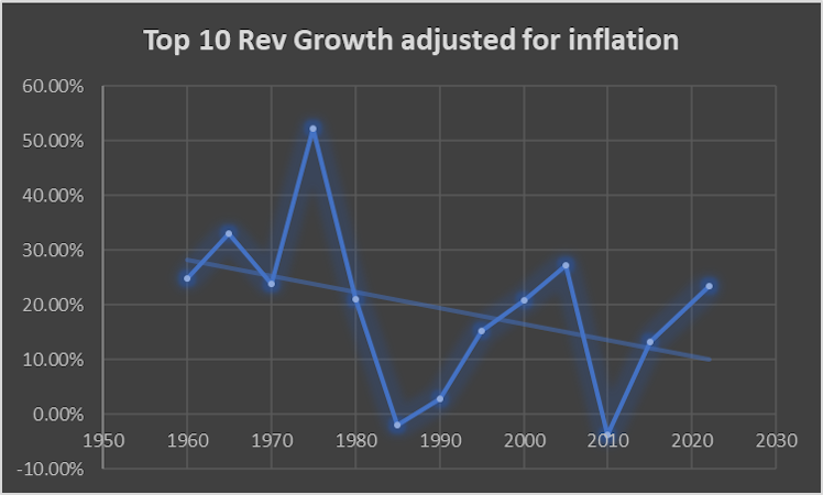
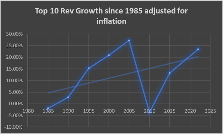
Here is the same chart without the outlier of Oil cos 3X their revenue. I set the data point for that period (1970-1975) to be equal to the average of the previous 5 periods):
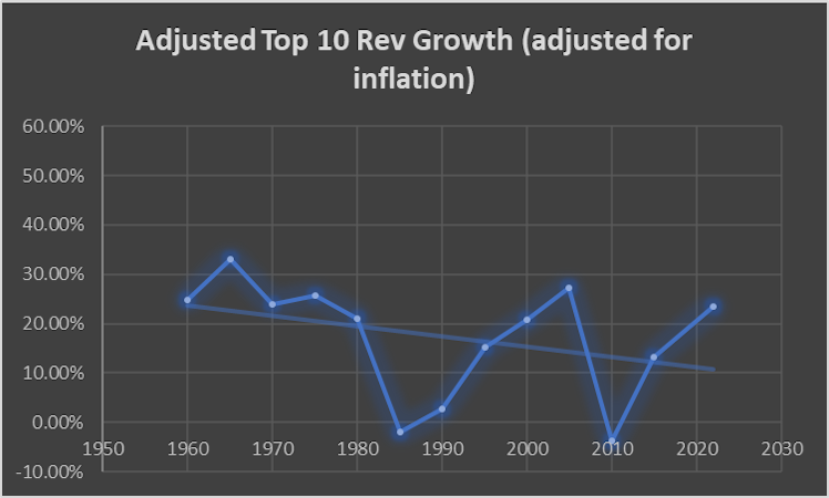
Now before you start thinking the rate of growth is shrinking, here is the best fit line since 1985:
Will be condensing everything into a post at some point but wanted to start getting some of this data out there as it may be a while before I finish.
Already have an account?