Trending Assets
Top investors this month
Trending Assets
Top investors this month
$13.1MFollowers
Want to practice some technical analysis? Look at the Dividend Aristocrats.
I'm going to call them DA for this memo so I don't have to type it out every time.
I've been updating some of my charts this morning and I noticed that updating the DA seemed a lot easier and quicker than the others; their patterns and trends form over longer timespans than many of the other stocks and this makes them much easier to identify.
With nothing to back up my hunch, I suspect that this is because people tend to buy and hold DAs to take advantage of the dividends rather than actively trade them. That's not to say they can't be short-term traded, but I think they're pretty good candidates to let you practice or even dip your toe in the water for the first time.
Let's see some nice examples.
Without adding anything to the graph we can already see that it's been trading sideways for a while; 6 months in fact.
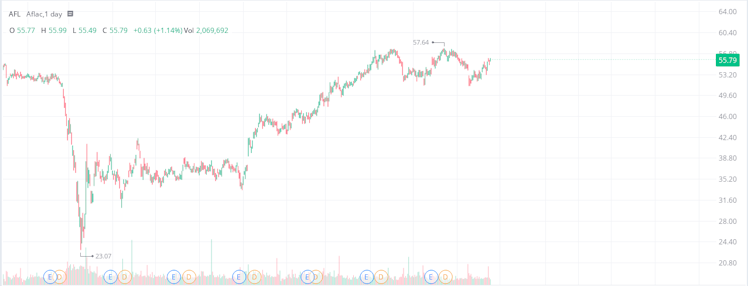
If you zoom in to the recent 6 months, you can quite easily draw the boundaries of the trading range.
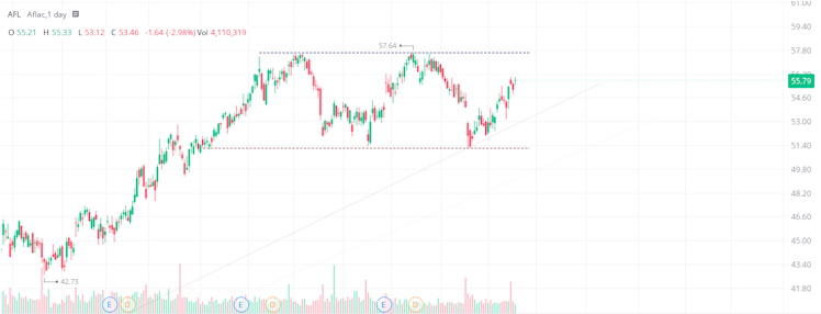
You could then use these boundaries as quite simple but very effective indicators as to when to open a long/short position, when to take your profit, and where to put your Stop Losses.
Trading ranges like this are how I started my technical analysis and where I continue to have a large proportion of success.
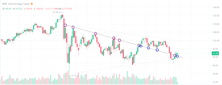
Atmos isn't quite as easy to see on the daily chart but swap to the weeklies and it filters out some of the noise.
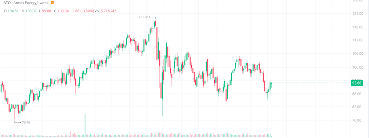
You can see that the highs appear to be decreasing, so we can draw an upper boundary up there. And, ignoring the large outlier (although the open fits nicely), the bottom looks fairly flat so we can draw a horizontal support there.
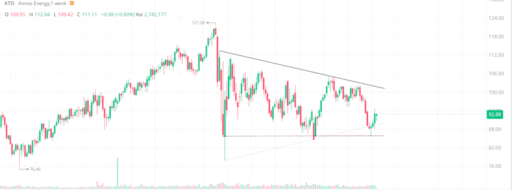
And if you see patterns that have since been broken
a) that's fantastic, because you're seeing patterns
b) don't be afraid to draw them and keep them for later.
See below at how an earlier downward trendline restricted upwards price movements (purple circles) but, after it was broken, the exact same line was used as a support (blue circles).
Whether on the weekly or daily chart for $GD, a nice uptrend that started this time last year can be seen, with the price bouncing from it a number of times.
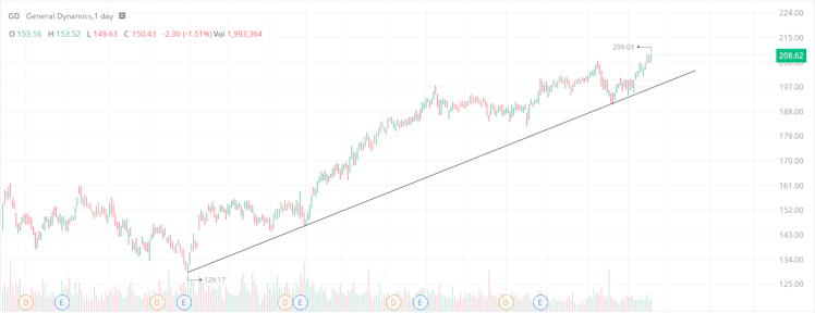
From it's current price point, Wall Street gives it an attractive upside of 20%! You could certainly justify buying it now for that 20% and the promise of dividends, or you could try to squeeze out a little more by optimistically waiting for the next bounce from the trend to get a better entry price.
Another nice trading range here, with the support coming in to play 8 months ago.
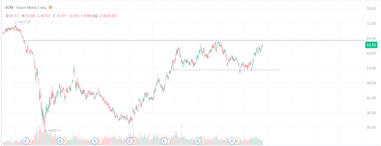
You could play $XOM in a couple of ways using the chart above:
a) expect a breakout above the resistance due to the oil prices
b) expect the oil bubble to pop and the stock to drop and short it when it hits the resistance
c) both - if you play for one and the opposite happens, simply close your trade (unless your Stop Loss has done it for you) and trade in the other direction.
I believe there are currently 65 DA and there are patterns in all of them (some quite apparent and others not so) and, because they seem to form more slowly, they are fantastic for practicing with.
Congratulations! You are now doing Technical Analysis! :)
Already have an account?