Trending Assets
Top investors this month
Trending Assets
Top investors this month
Track to an Appropriate Benchmark Index & Know Your Performance Gap
My attention was piqued when I came across this article in Yahoo Finance:

Articles that discuss average retail investor returns are interesting because of our natural inclination to compare ourselves to others. We all like to think that we’re better than average. These articles cover the performance/return gap between actual investor returns and the returns of the broad market index. This particular article points out the wide performance gap that opened up between November 2021 to present. Highlighted was this astonishing statistic:
"The average retail investor portfolio is down by about 27% since November 2021, according to data compiled by VandaTrack Research. Since then, stocks have staged four double-digit bear market rallies. Tech stocks in particular rallied more than 20% - twice"
Ouch !
The following chart emphasises the point:
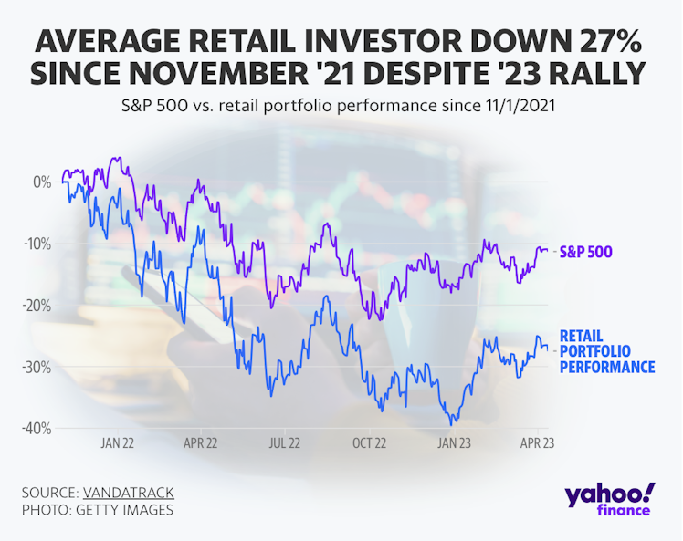
There’s a dramatic 15.6% performance lag between returns achieved by the average retail investor and the returns of the S&P 500 index. We’re talking "average", so intuitively there's a foreboding sense that 50% of retail investors performed even worse. Double ouch ! But before we take this statistic at face value, we really need to slow down to engage our "System 2" thinking and scrutinise the information being presented here.
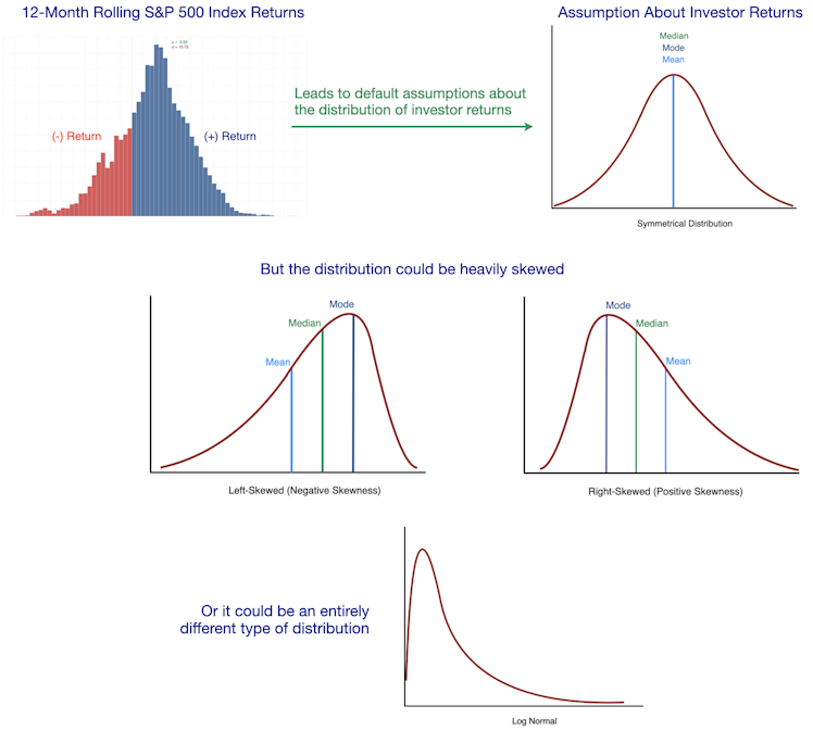
Everyone should be aware of the "flaw of averages". Averages can mislead and paint a false impression of the real state of affairs, especially when no measure of dispersion has been provided. Context is important and useful detail is often hidden in the averages.
We have no idea what the distribution of investor returns looks like. There could be a wide dispersion of returns, making the distribution curve very flat. Or maybe the distribution has a fat tail, creating skew to heavily distort the average. We know that average incomes are distorted because the super-rich outliers push the average well above the median. This relegates the average statistic to be a poor measure of centrality when it comes to income.
Most of us assume the distribution of investor returns is a bell curve because market index returns have a symmetrical bell-shaped distribution. It’s not a stretch to assume investor returns would follow a similar distribution. But in all my research, I have never been privy to seeing a distribution of actual investor returns. I could assume a bull-curve, but that could be hazardous. If there’s any skew in the distribution, it will be hard to know what percentage of investors fall above and above the average. A lot of investing articles give you the click-bait, attention-generating statistic, but very little other useful information to go with it.
It’s important to also assess the integrity of the study, provided the information is available. I’ve seen more than my fair share of shoddy research in my time, even from the reputable institutions. If the incentive to nudge people toward a certain action is strong enough, clever deceptions materialise. Sometimes the data collection and sampling process is compromised enough to invalidate an entire study. We need to ask ourselves:
- How large is the sample size?
- What’s the source of the raw data for retail investor portfolios?
- What are the demographics of the retail investors under study?
- How often are these investors trading?
- Is the sample population representative of the wider retail investor population?
Unfortunately, the original research from VandaTrack doesn’t appear to be available to public. This is a real set back because we can’t scrutinise the integrity of the study. However, the article does provide a little more context on the nature of the investors being studied:
"Average retail investor allocations are very concentrated and largely titled towards tech stocks. Nearly 30% of retail portfolios are in Tesla and Apple, along with 10% in other mega-caps like Nvidia"
Portfolios with tech concentrations suggest a younger demographic. This is obviously speculation on my part, but we tend to be products of the era we grew up. Older investors with multiple decades in the markets are likely to have built up large positions in either market index funds or industry stalwarts such as Procter & Gamble, Johnson & Johnson, American Express and Walmart. Older investors tend to maintain portfolios that resemble the stability of Warren Buffett’s portfolio than the bleeding edge growth characteristics of Cathie Wood’s portfolio. If the data for the study was sourced from an App like Robinhood, then there's a good chance the cohort leans more towards trading stocks than long-term investing.
Given the investor portfolios under study have high tech concentrations, will the S&P 500 index be a suitable performance benchmark? A higher tech concentration suggests a younger cohort of investors who may have a propensity to trade short-term. The S&P 500 has a 26% allocation to the Information Technology sector and an 8% allocation to the Communication Services sector which includes companies like Alphabet and Meta. By comparison, the NASDAQ 100 index has a 52% allocation to Information Technology and a 16% allocation to communication services. I've seen a lot of portfolios right here in Commonstock that have very tech heavy concentrations. Maybe the NASDAQ 100 index is a better apples to apples comparison of performance.
We can use the same period (1 November 2021 to 11 April 2023) to plot the performance of the 4 major indices to get better context on the returns of the average retail investor:
- Dow Jones Industrial Average Index (30 large-cap sector leaders)
- S&P 500 Index (500 large-cap companies representative of the US economy)
- NASDAQ 100 Index (100 of the largest non-financial companies on the NASDAQ exchange)
- Russell 2000 Index (2,000 small-cap stocks)
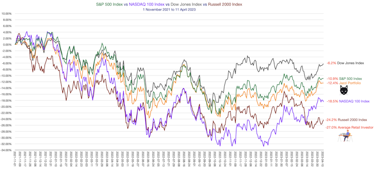
We can see the Dow Jones Industrial Average performed the best over this period. This isn’t surprising given the 30 stocks in the index are the stalwarts of their respective industries. Many of these businesses have defensive qualities which tend to shine when turbulent markets cause a flight to quality. The other side of the coin is many of these "defensive" stocks will tend to lag the index when the market is at its most exuberant.
Despite the additional context, it’s still a bad result for the average retail investor. The -27% return puts us squarely at the bottom of the pile. This is more akin to the small-cap Russell 2000 index. The -8.5% performance gap with the tech-laden NASDAQ 100 index suggests this index might a better basis of comparison. The retail investor may have plunged in unison with the NASDAQ 100 index and due to crystallised losses, failed to recover.
It’s too bad we aren’t given more insight to help us better understand what mistakes retail investors are still making:
- Are we trading too much?
- Are we buying too many stocks in low quality, speculative businesses?
- Has our natural flight response led to the unnecessary crystallisation of losses?
- Are retail investors taking on board too much risk in the good times, only to regret it later when the market turns sour?
We know one of the prime contributors to the performance gap is the investor behaviour gap, a term made famous by financial planner Carl Richards. The behaviour gap is the difference between the return of an investment and the actual return achieved by investors in that investment. Probably the most famous case studies demonstrating the behaviour gap was the Fidelity Megallen Fund managed by legendary investor Peter Lynch. Lynch racked up an average annual return of 29% during his 13 year tenure running the fund from 1977 to 1990. However, Fidelity Investments reported the average Magellan Fund investor actually lost money during that period. Investors were unable to ride out the paper drawdowns, choosing to "trade in or out" of the fund instead of just riding out the paper drawdowns. Truly mind boggling.
When you track your portfolio returns against a benchmark index, you get important feedback. I’ve plotted our US portfolio returns on the index returns chart to show we lagged the returns of the S&P 500 index by 1.5% over that period. As much as I would love to be beat the S&P 500 index, the result is entirely in line with our expectations because our portfolio has a market index fund at the core with a moderate tilt towards individual technology growth stocks and smart-β funds. I expect the portfolio to lag the S&P 500 index in difficult market conditions just like the NASDAQ 100 index does. I also expect to slightly beat the S&P 500 index when the good times come storming back. When you beat a market index on the upside, you should probably expect to underperform on the downside. This is the symmetrical nature of risk and return. The cost of outperforming the index in good times is usually deeper drawdowns in bad times.
You don’t need to go to the time and effort to plot your portfolio against a benchmark index in a chart like I did for the purpose of this exercise. I use a shortcut that is equally effective at understanding the characteristics of our portfolio. We can become so preoccupied with adding the most promising stocks to our portfolio, we can overlook how the portfolio as a whole will behave under different market conditions. We might full our portfolios with high return stocks, then curse when they all plunge in unison giving your portfolio no cushion at all. We've had the satisfaction of trouncing the market during the bull run, but when the hibernating bear awakens, we can discover the subsequent drawdowns can be very uncomfortable. If this is the case, we should realise we took on too much risk during the good times and should remember this for next bull market (many probably won’t).
This is the table I use to compare my portfolio drawdowns in a bear market against the other benchmark indices:
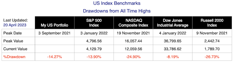
You can see I'm still lagging the S&P 500 index. You have to adjust your figures to account for cash inflows (including reinvested dividends) and outflows so you’re comparing like-for-like with capital indexes that don’t include dividends. I rely on the performance figures provided by Schwab to automatically calculate the adjusted figures correctly.
Once the S&P 500 index recovers to reclaim previous all time highs to begin a new bull market, I’ll be tracking my portfolio gains against the market indices using a similar table:
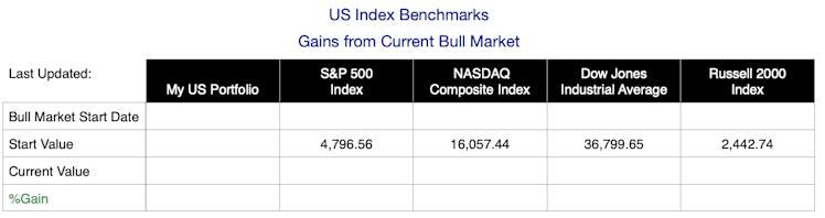
Tracking your portfolio in this manner provides a quick checkup to find out if it’s performing to expectation. If my portfolio has a deeper drawdown than the S&P 500 index in a bear market, I should expect my portfolio to have a higher gain in a bull market to more than compensate for the additional risk I’ve taken. If this doesn’t happen, then I’ve misjudged the risk/return attributes of one of more of my individual stock picks or smart-β funds. I haven't been rewarded for the extra risk (as measured by price volatility) I've taken.
To summarise:
- Cast a critical eye on articles about retail investor underperformance and don't let it give you an inflated sense of self. Statistics can be misleading.
- Choose a benchmark index with a similar risk profile to your portfolio and track your performance to benchmark.
- Use that feedback to help calibrate the "Goldilocks" amount of risk/return you can live with.
www.vandaresearch.com
News - Vanda
Already have an account?