Trending Assets
Top investors this month
Trending Assets
Top investors this month
$13.1MFollowers
VIX - using technical analysis to determine overall market sentiment
The VIX (Cboe Volatility Index) is a real-time index derived from the prices of SPX (S&P 500) options with near-time expirations; it shows how the market is feeling today about what things will look like 30 days in the future. It's a great tool to gauge short-term market sentiment and plan swing trades accordingly. If you can extrapolate the data it is giving you then it also becomes a great tool to determine what the sentiment may be even further down the line.
If you're unfamiliar with the VIX and options, it is typically the case that lower volatility means a more bullish sentiment and higher volatility means a more bearish sentiment. This is an overly simplified observation but is a widely accepted perspective.
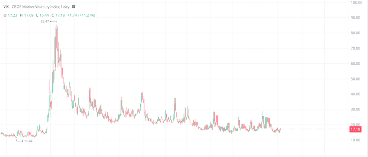
Above is the chart for the VIX, and the huuuuge spike upward starts in late-Feb 2020 when Covid started rocking the world and, as a result, the markets. There was great uncertainty around what would happen and everybody began to sell-off their positions - a massive bearish sentiment resulting in a huge spike in volatility.
Now, what is super cool is that an index derived from the prices of derivatives of 500 different companies is a perfect candidate for technical analysis. It may seem counter-intuitive but I personally find it much easier to do technical analysis on the VIX than I do on individual stocks.
If you consider how many option contracts there are for 500 companies expiring in the next 30 days, then you are working with an incredibly large dataset and, as a result, there is a very nice smoothing effect which minimises the effect of outliers.
It stands to reason that if technical analysis is supposed to estimate future security prices based on historical data then it can also be used to anticipate future volatility (and therefore sentiment) of these security prices in the same way.
So, what is the VIX telling us right now? First of all, you don't need me to tell you that volatility has been decreasing since the initial Covid panic. But there has been a lot of talk and FUD about a possible 10% retracement of the market as we head into 2022 and you can actually start to see this on the VIX.
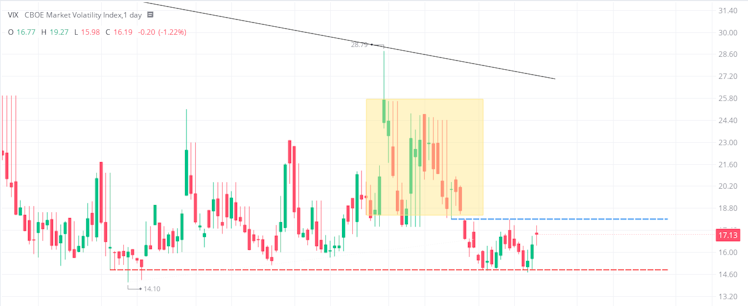
In the chart directly above, we can see that the VIX has been struggling to continue its push lower for the past 6 months - volatility is flattening which suggests that the bullish surge is starting to waver.
Also notice the comparatively congested segment in the yellow box, and the density of wide-ranging candles compared to other areas. Now that you're aware of this congestion, look again at the first image and this area will stand out much more against the rest of the VIX.
The volatility of the volatility in this area shows that the bears and the bulls were toing-and-froing quite hard, and despite the bulls pushing the volatility down they ultimately still could not break the previous low set in June.
The fact that volatility is struggling to decrease suggests that brokerages and institutions (they write the majority of options) are taking a slightly less bullish stance on the economy. If the VIX manages to break below the support (red dashed line) then the bullish sentiment will continue. If it breaks above the relative resistance (blue dashed line) then I'll start being more cautious about opening new positions. If it later breaks above the solid black line, breaking the downtrend, I will strongly consider scaling out of my positions and waiting to see how the market develops.
Already have an account?